

Art Direction & Design
︎︎︎UMI Fund
︎︎︎UMI Fund
2023
USA
USA
UMI Fund newsletter
UMI Fund team asked me to design a newsletter template, along with developing a new concept of how they could improve their visual communication.
UMI Fund is a donor’s collaborative founded by international philanthropies that supports, incubates and accelerates strategic elements of the climate grassroots movement.
I developed the concept and design for a series of collage images featuring natural elements to convey a strong, appealing visual message aligned with their target audience (young activists) and their mission (climate activism, nature, and care).
UMI supports young grassroots collectives. Communicating that visually was a priority. That is why the collage-style was chosen as a way to have a touch of reality. But also representing a reality that is being dreamed of. A clear, ambitious goal, with solutions being drafted along the way — a work in progress, these young activists are working for. Possibilities are endless.


Rebranding
︎︎︎Climáximo
︎︎︎Climáximo
2023
Portugal
Portugal
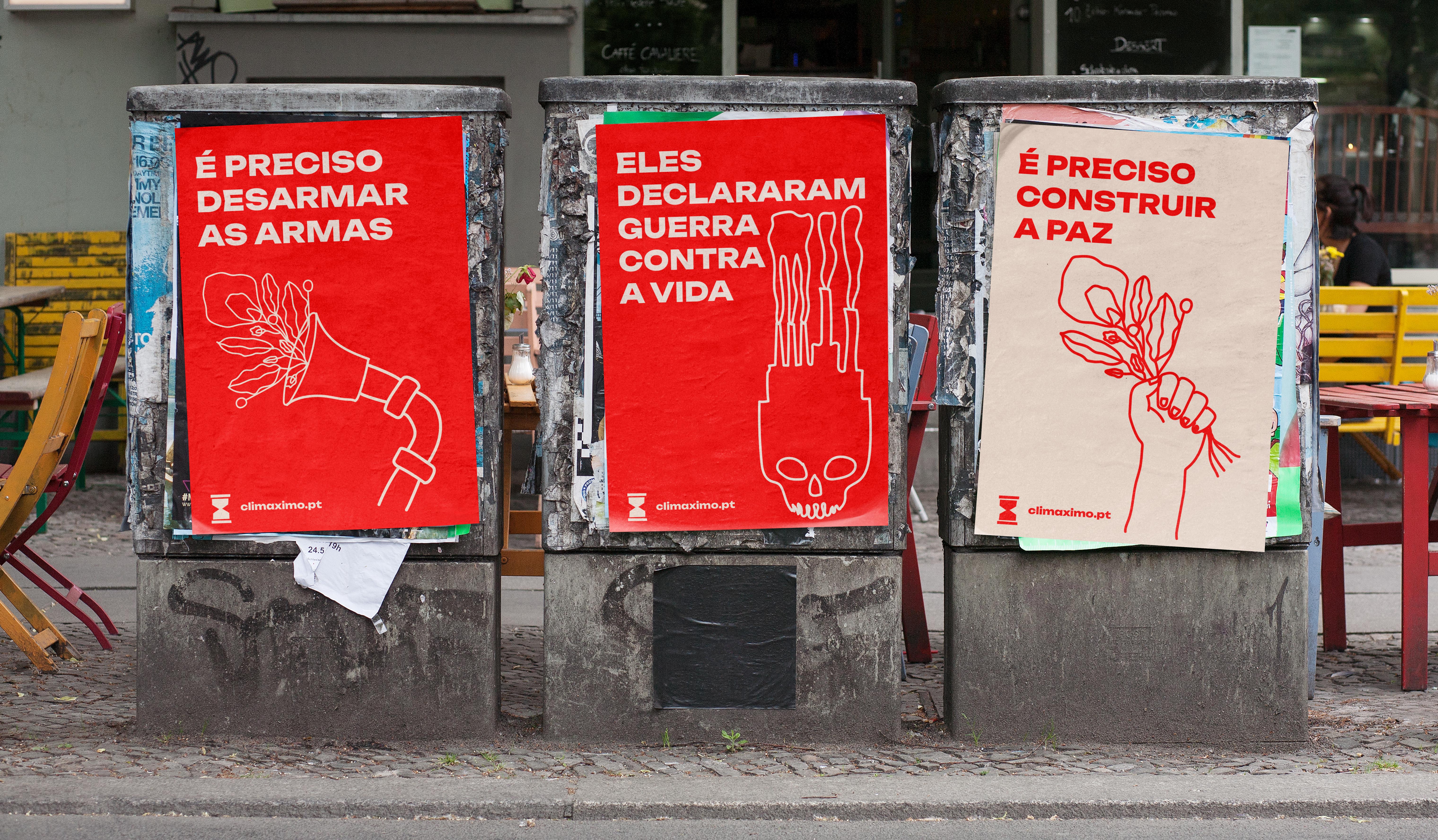
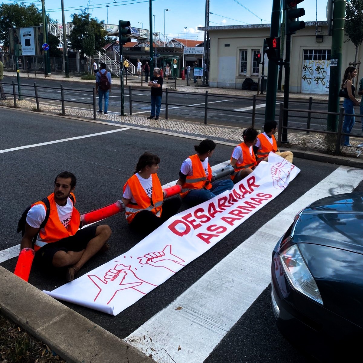
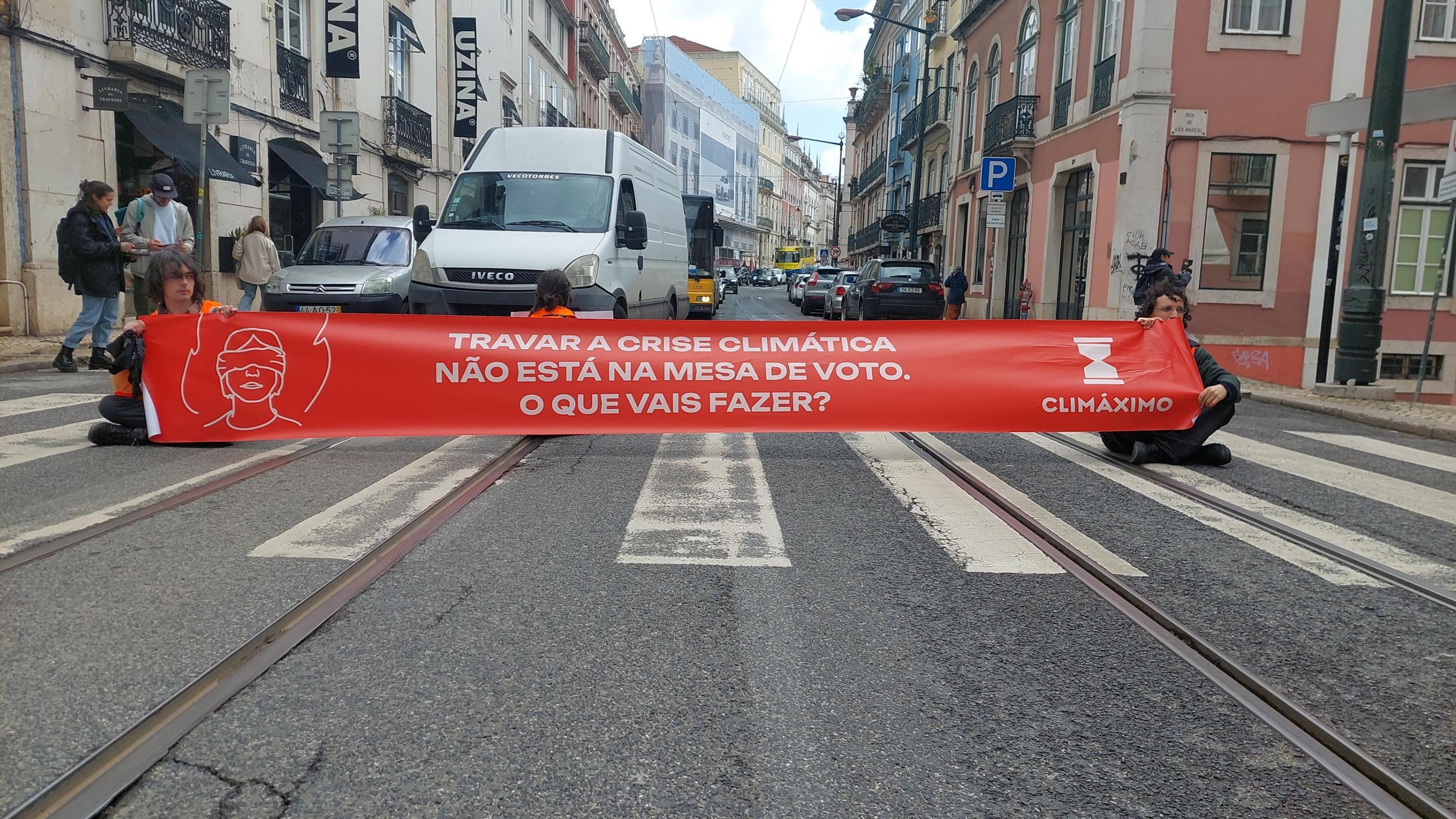
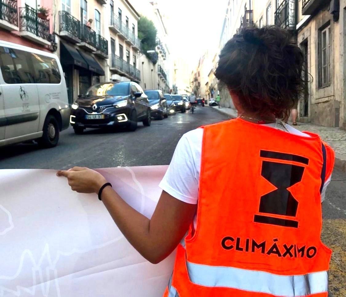
Climáximo rebrand
Climáximo is a climate activist collective from Portugal. They have been active since 2015. Climate policies haven’t changed much since then.
After the hottest summer ever registred (2023), they deciced they needed to change their narrative in order to be more effective and concise with their urgent message. They asked me to translate that new narrative visually.
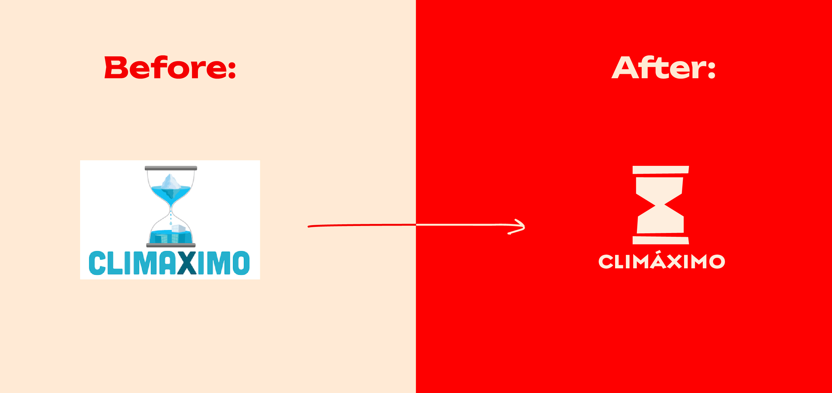
The goal was to have designs that could translate the “state of war”, but also a balance with a message of hope.It should be simple, clear and easy to use.
Visual consistency and language were a priority througout all communication channels (online and out on the streets).
Visual consistency and language were a priority througout all communication channels (online and out on the streets).


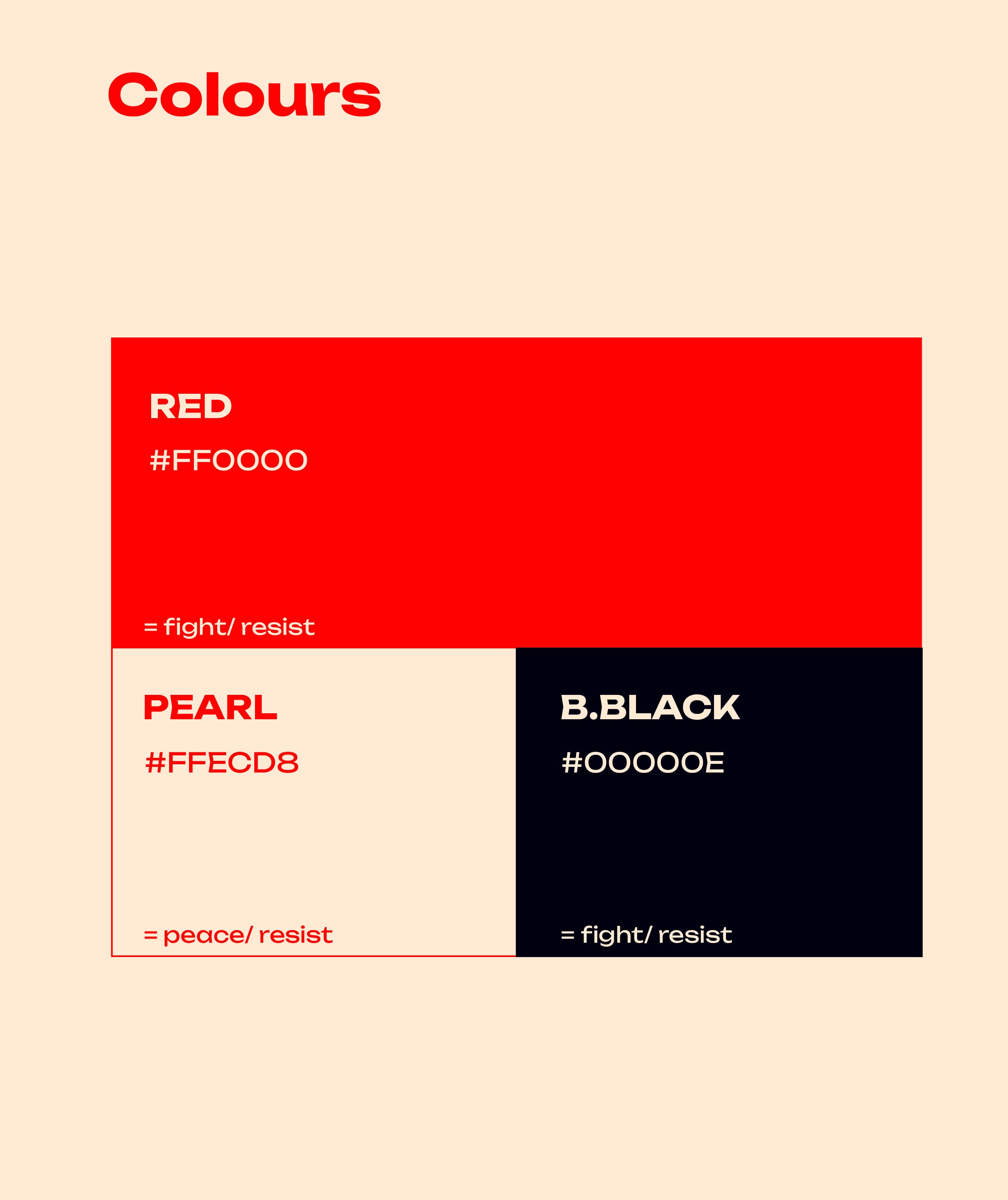
The red was chosen to highlight the sense of urgency, alert — it cannot go unnoticed because of its brightness. It can be as uncomfortable as the truth the collective is trying to bring to light.
The Pearl and Black were thought of as both positive/ negative. Neutral, yet powerful contrasts giving more meaning to the path forward — resistance to get to a state of peace.
The Pearl and Black were thought of as both positive/ negative. Neutral, yet powerful contrasts giving more meaning to the path forward — resistance to get to a state of peace.
These bold, bright and neutral colours were thought of to translate the state of emergency and convey the clear message the collective wants to get through: “We are at war, but we are working to create a better future for all”.
Giving the honest and harsh truth, while offering a way out of the emergency state.
Giving the honest and harsh truth, while offering a way out of the emergency state.
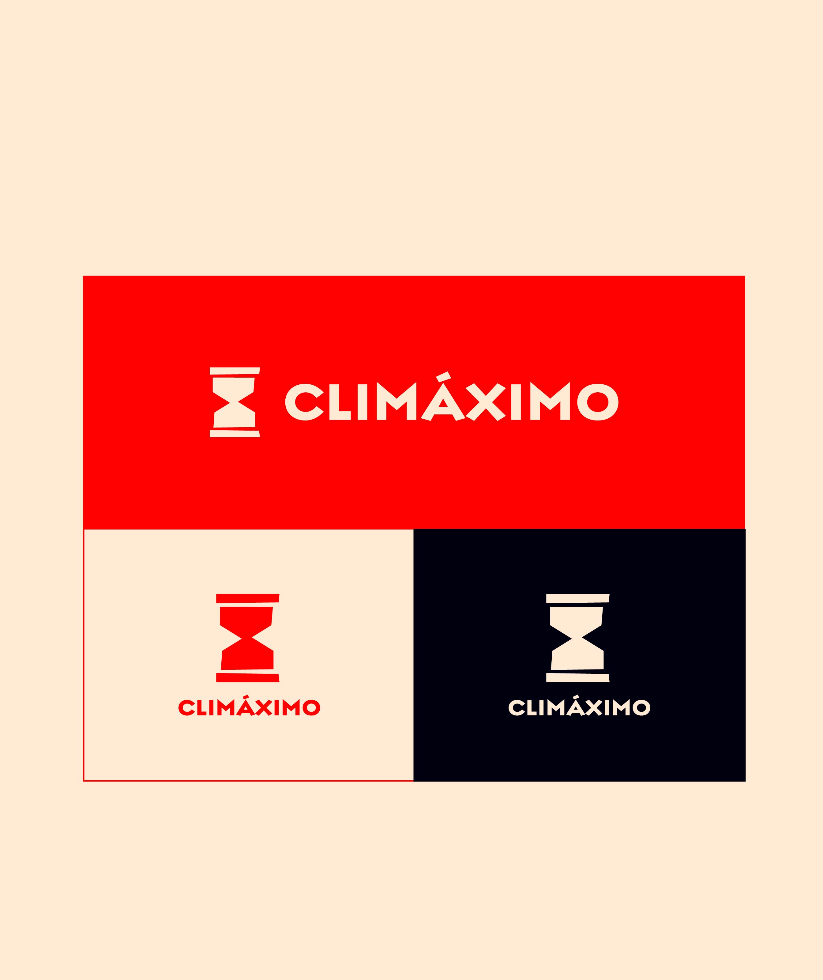
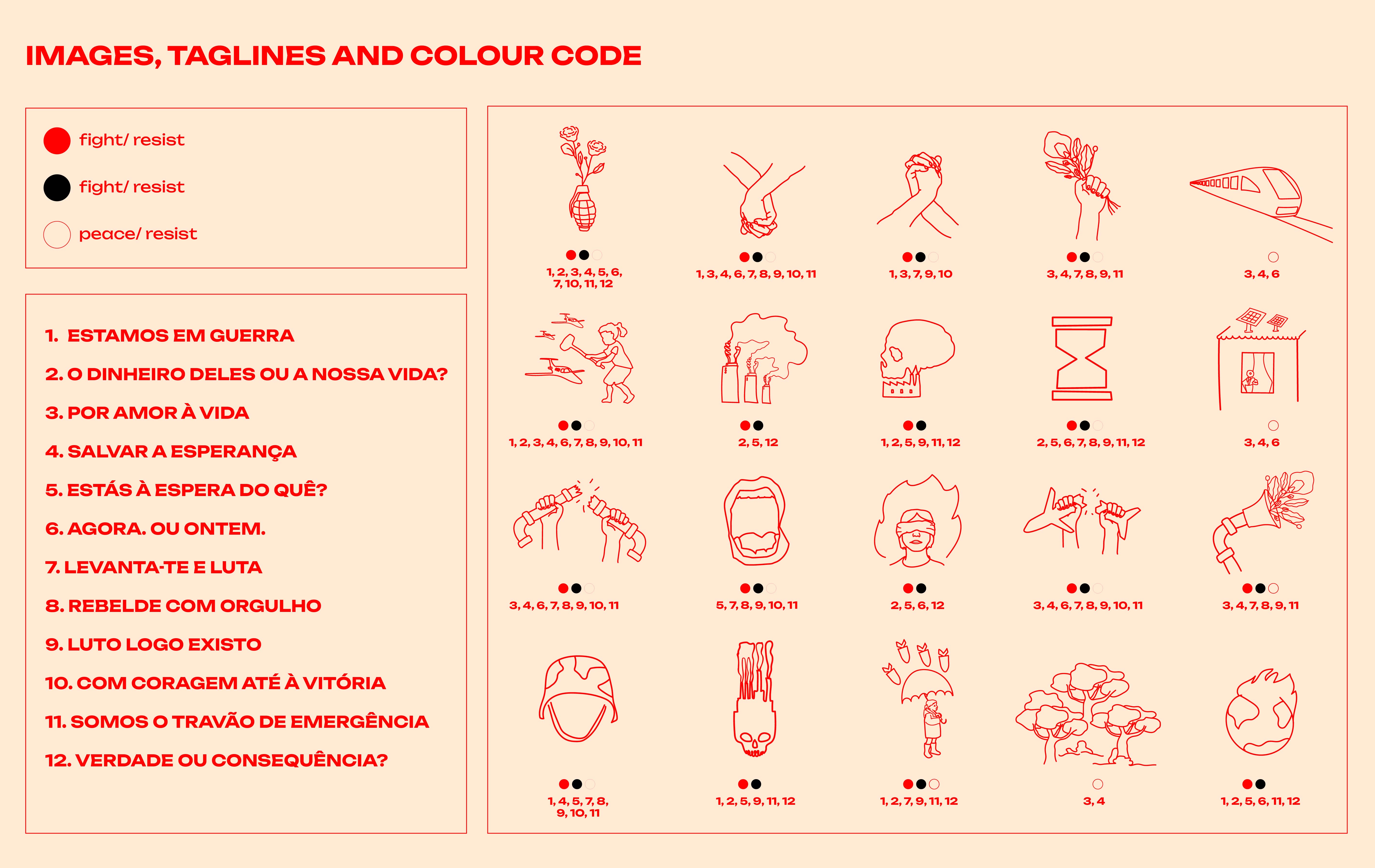
A set of taglines with corresponding illustrations and colour coding was created to help get the message through.
It also helps give the visual consistency when communicating, which the collective was lacking. With a system of specific taglines, illustrations and colours, it is possible to communicate with coherence while translating a complex message into a simple and relatable one.
It also helps give the visual consistency when communicating, which the collective was lacking. With a system of specific taglines, illustrations and colours, it is possible to communicate with coherence while translating a complex message into a simple and relatable one.




Design & Art Direction
︎︎︎ PAR respostas socias
︎︎︎ PAR respostas socias
Portugal
2025
2025
Youth to youth without borders
Concept and design for this publication. It aims to be a conclusion manual, giving guidelines and concrete examples to develop personal and social skills among and between young people.
Par — respostas sociais is an NGO that values and is active in national and European networks. Their mission is to create, implement and inspire social responses. By empowering young people, they aim to promote the development of their communities.
The concept for the cover was simple:
mirror — literally reflecting the “youth to youth”, highlights the equality between peers.
sinuous lines — without beginning or end, because it’s an open road. Open to everyone who wants to join in, with no roadblocks. And always in constant improvement. It’s a fluid path for everyone willing to be part of it.
sinuous lines — without beginning or end, because it’s an open road. Open to everyone who wants to join in, with no roadblocks. And always in constant improvement. It’s a fluid path for everyone willing to be part of it.

It’s a manual, yet a very practical one. The idea behind the colours was to have a direct and fun communication, while also being a reliable source of practical knowledge.


Divided into three chapters, each chapter has its main colour, so it’s easy to navigate. The red and blue were chosen as the main colours to give a sense of rebellion (red), yet a good and soothing one (blue). Both colour tones balance each other while developing a sense of belonging to the mission of the book.


Rebranding
︎︎︎campact!
︎︎︎campact!
2023
Germany
Germany
campact! rebrand
Campact! is a campaign organisation based in Germany, with over 4.25 million members who advocate for progressive politics and defend democracy. They have been influencing politics for over 20 years and are committed to climate protection, social justice, and a strong civil society. Campact! also includes a petition platform, WeAct, where one can start their own petition.
The creative team challenged me to brainstorm together and come up with a proposal for a rebranding refresh for both campact! and WeAct.


Branding
︎︎︎Echoes
︎︎︎Echoes
2024
Echoes Residency branding
Echoes residency was created to frame current impulses from the margins with a particular focus on collaboration and communication. Based on the exchange, resonance and impact of non-institutional knowledge, Echoes is committed to being a caring, community, shared, collective, progressive resource.
The team asked me to translate their intentions visually.



Part of Clean Creatives and Creatives for Climate.
Services:
︎︎︎ Strategy
︎︎︎ Branding
︎︎︎ Editorial and Print
︎︎︎ Motion Design