

Design & Art Direction
︎︎︎ PAR respostas socias
︎︎︎ PAR respostas socias
Portugal
2025
2025
Youth to youth without borders
Concept and design for this publication. It aims to be a conclusion manual, giving guidelines and concrete examples to develop personal and social skills among and between young people.
Par — respostas sociais is an NGO that values and is active in national and European networks. Their mission is to create, implement and inspire social responses. By empowering young people, they aim to promote the development of their communities.
The concept for the cover was simple:
mirror — literally reflecting the “youth to youth”, highlights the equality between peers.
sinuous lines — without beginning or end, because it’s an open road. Open to everyone who wants to join in, with no roadblocks. And always in constant improvement. It’s a fluid path for everyone willing to be part of it.
sinuous lines — without beginning or end, because it’s an open road. Open to everyone who wants to join in, with no roadblocks. And always in constant improvement. It’s a fluid path for everyone willing to be part of it.
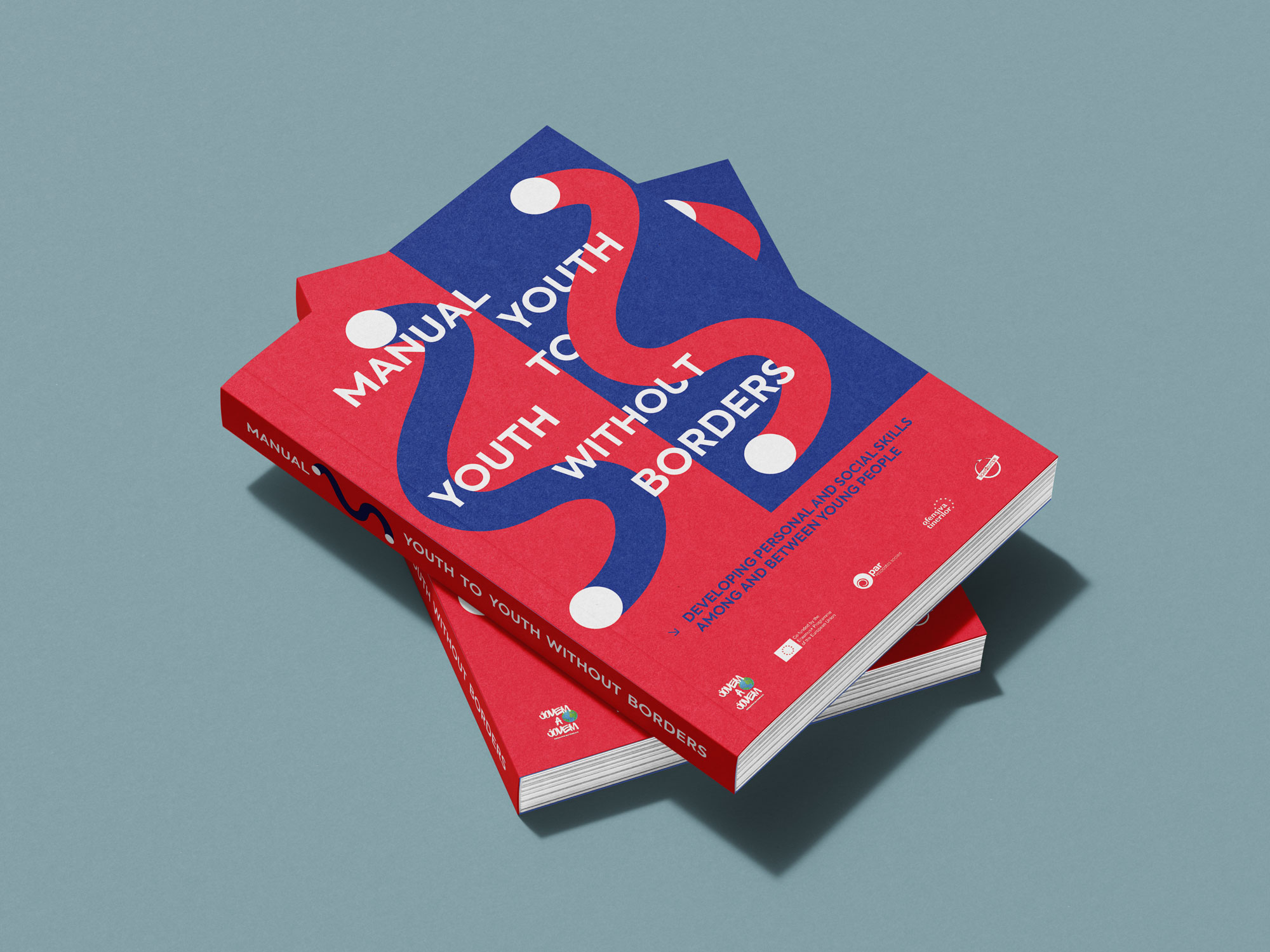
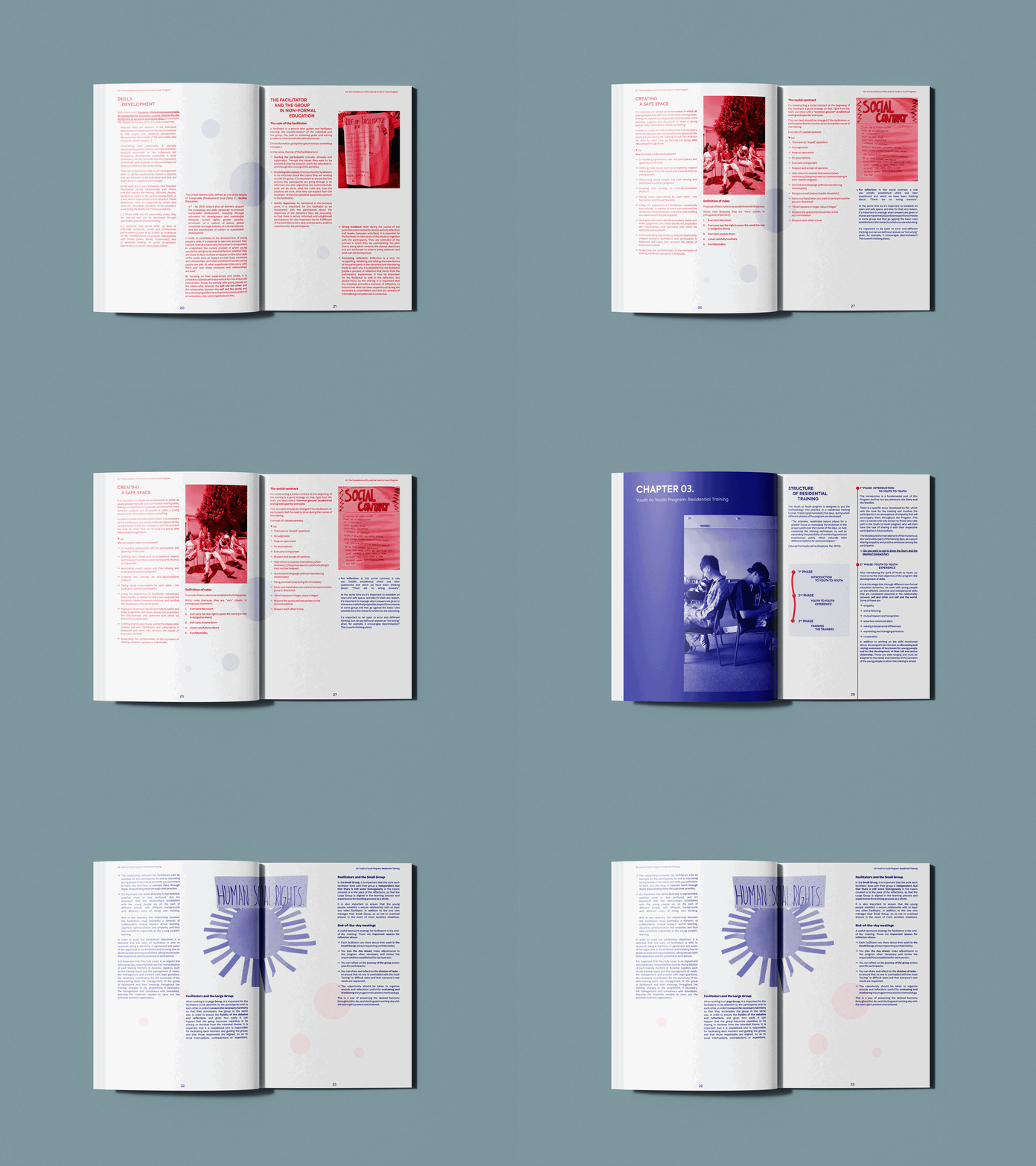
It’s a manual, yet a very practical one. The idea behind the colours was to have a direct and fun communication, while also being a reliable source of practical knowledge.
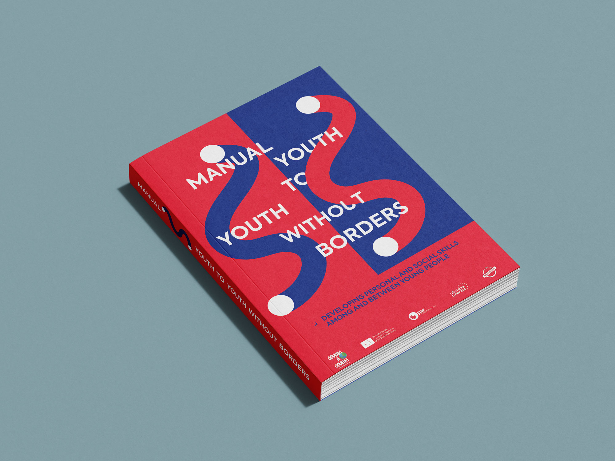
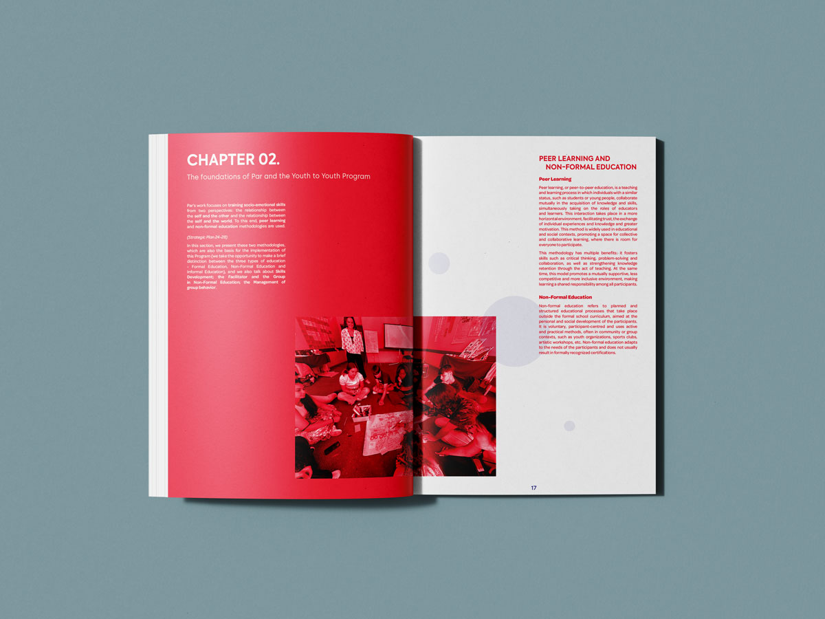
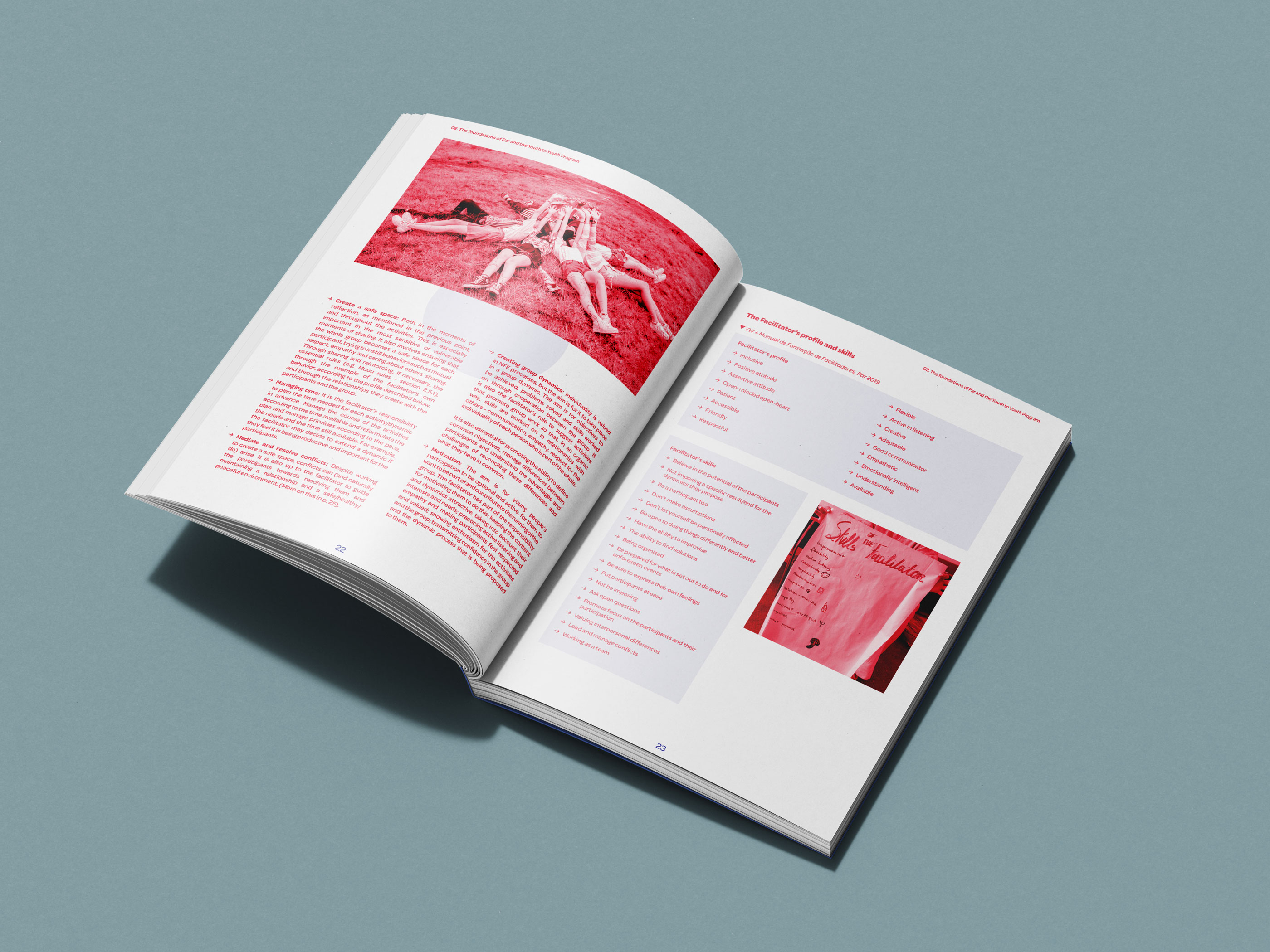
Divided into three chapters, each chapter has its main colour, so it’s easy to navigate. The red and blue were chosen as the main colours to give a sense of rebellion (red), yet a good and soothing one (blue). Both colour tones balance each other while developing a sense of belonging to the mission of the book.

Part of Clean Creatives and Creatives for Climate.
Services:
︎︎︎ Strategy
︎︎︎ Branding
︎︎︎ Editorial and Print
︎︎︎ Motion Design