

Rebranding
︎︎︎Climáximo
︎︎︎Climáximo
2023
Portugal
Portugal
Climáximo rebrand
Climáximo is a climate activist collective from Portugal. They have been active since 2015. Climate policies haven’t changed much since then.
After the hottest summer ever registred (2023), they deciced they needed to change their narrative in order to be more effective and concise with their urgent message. They asked me to translate that new narrative visually.
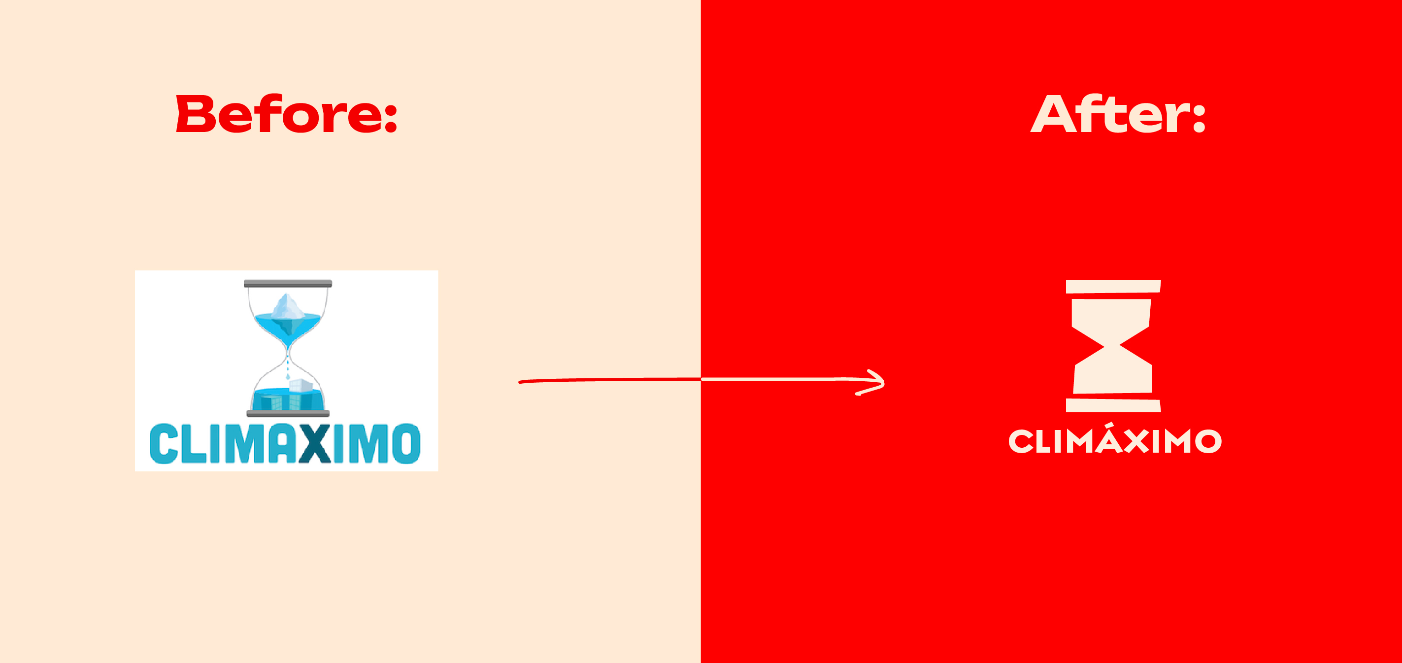
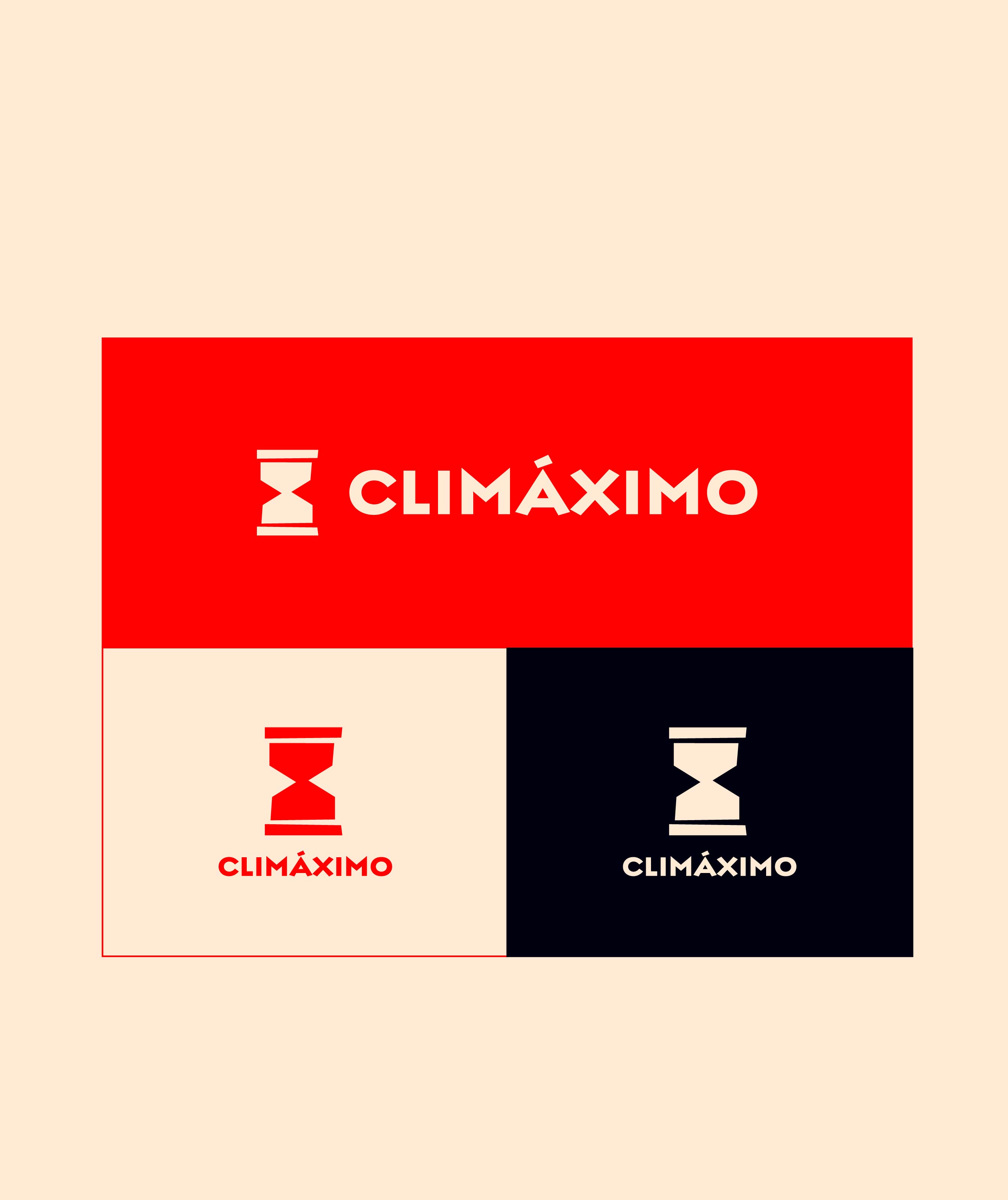
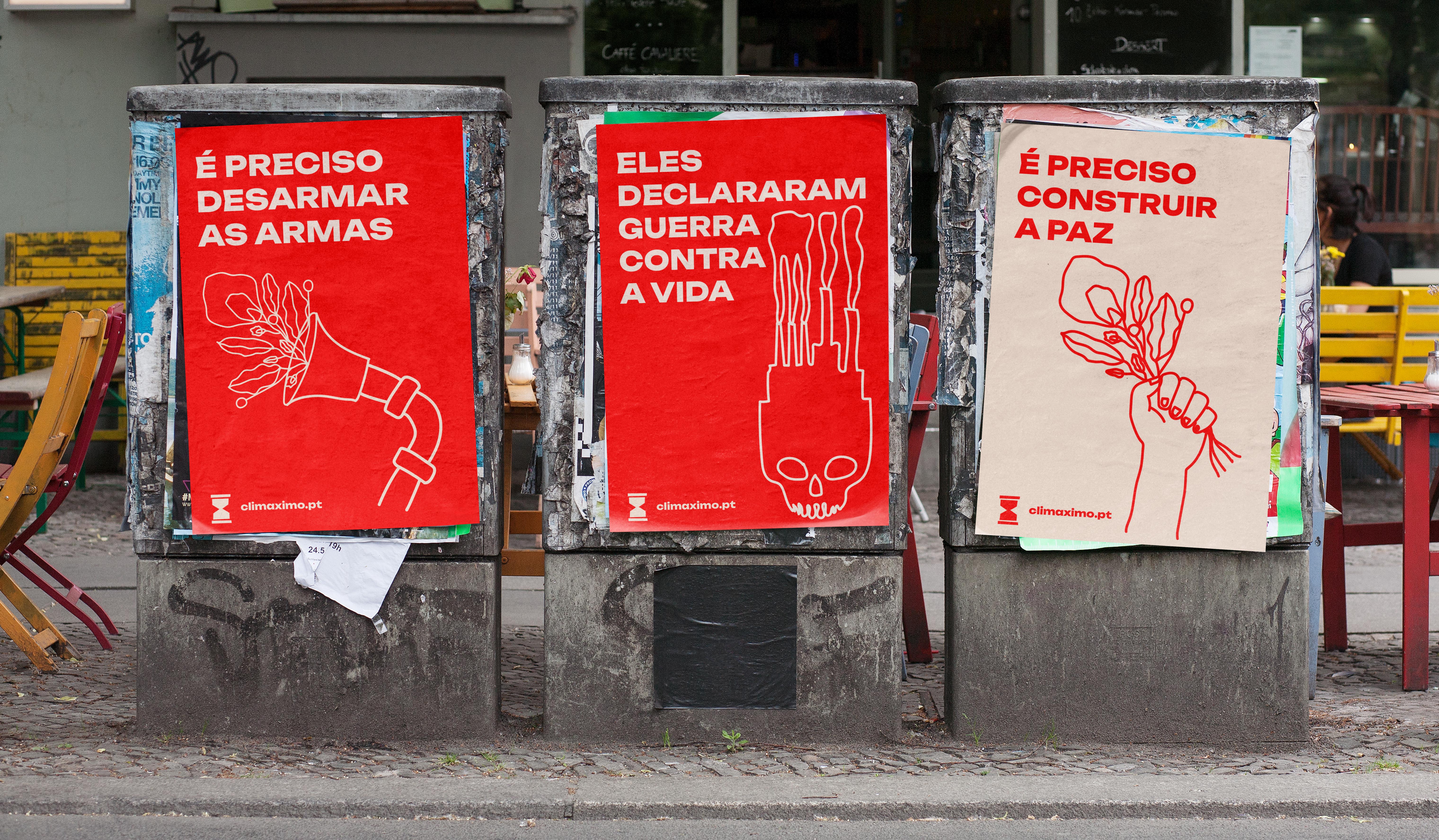
The goal was to have designs that could translate the “state of war”, but also a balance with a message of hope.It should be simple, clear and easy to use.
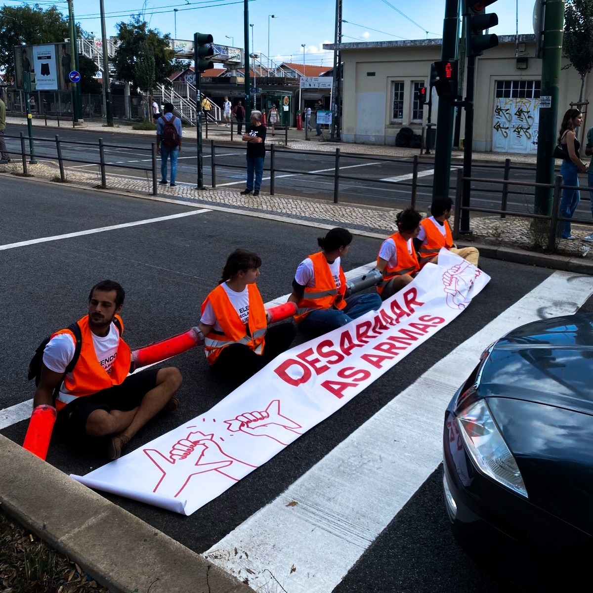
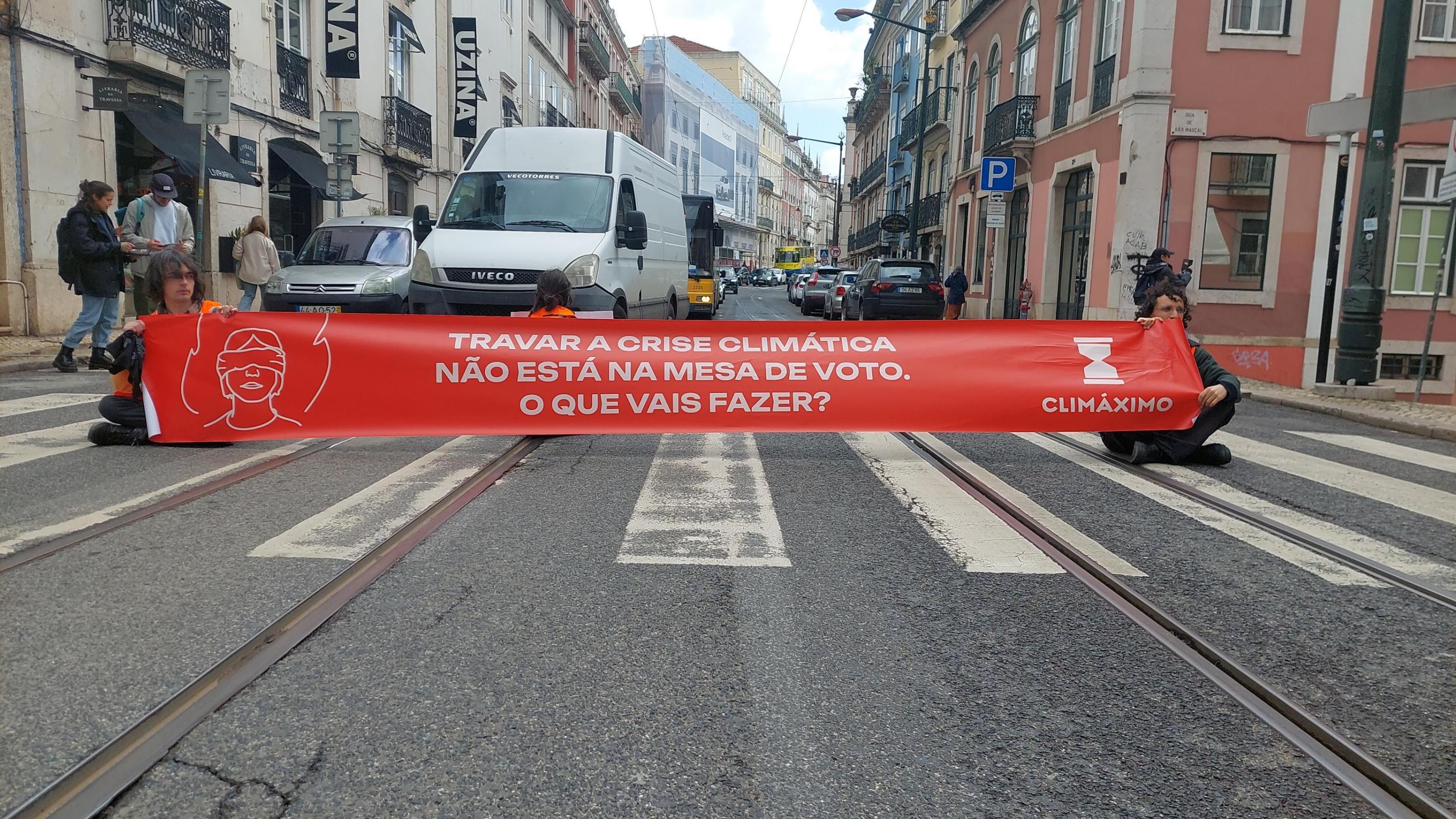
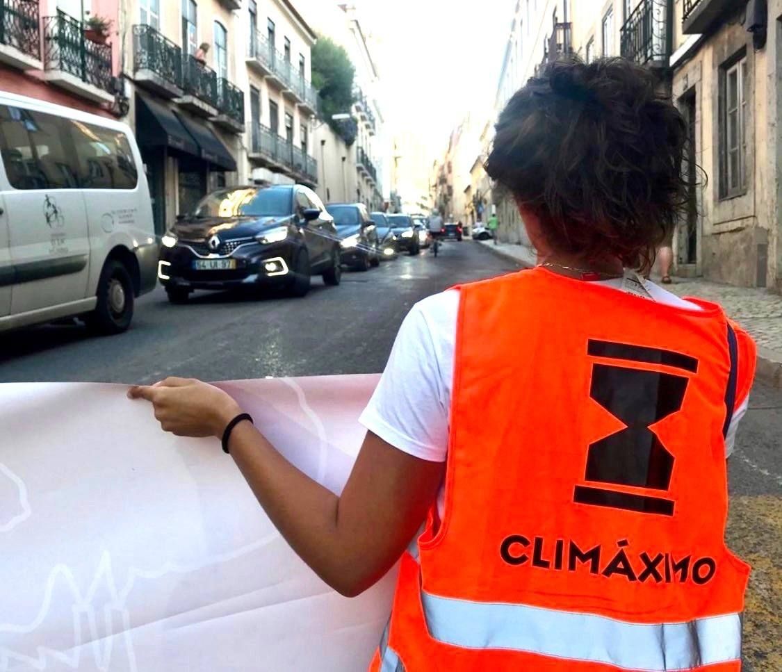
Visual consistency and language were a priority througout all communication channels (online and out on the streets).
Visual consistency and language were a priority througout all communication channels (online and out on the streets).


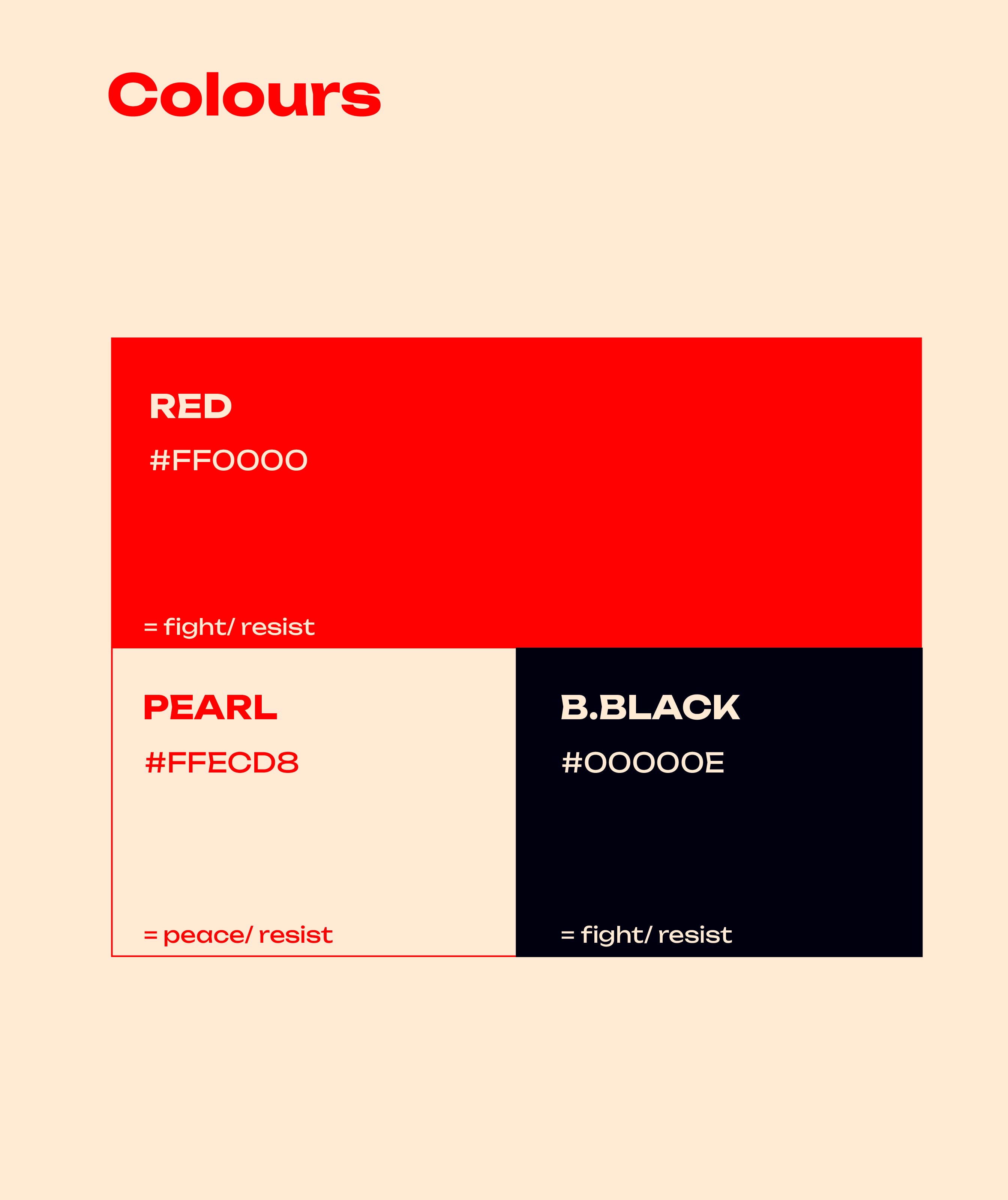
The red was chosen to highlight the sense of urgency, alert — it cannot go unnoticed because of its brightness. It can be as uncomfortable as the truth the collective is trying to bring to light.
The Pearl and Black were thought of as both positive/ negative. Neutral, yet powerful contrasts giving more meaning to the path forward — resistance to get to a state of peace.
The Pearl and Black were thought of as both positive/ negative. Neutral, yet powerful contrasts giving more meaning to the path forward — resistance to get to a state of peace.
These bold, bright and neutral colours were thought of to translate the state of emergency and convey the clear message the collective wants to get through: “We are at war, but we are working to create a better future for all”.
Giving the honest and harsh truth, while offering a way out of the emergency state.
Giving the honest and harsh truth, while offering a way out of the emergency state.
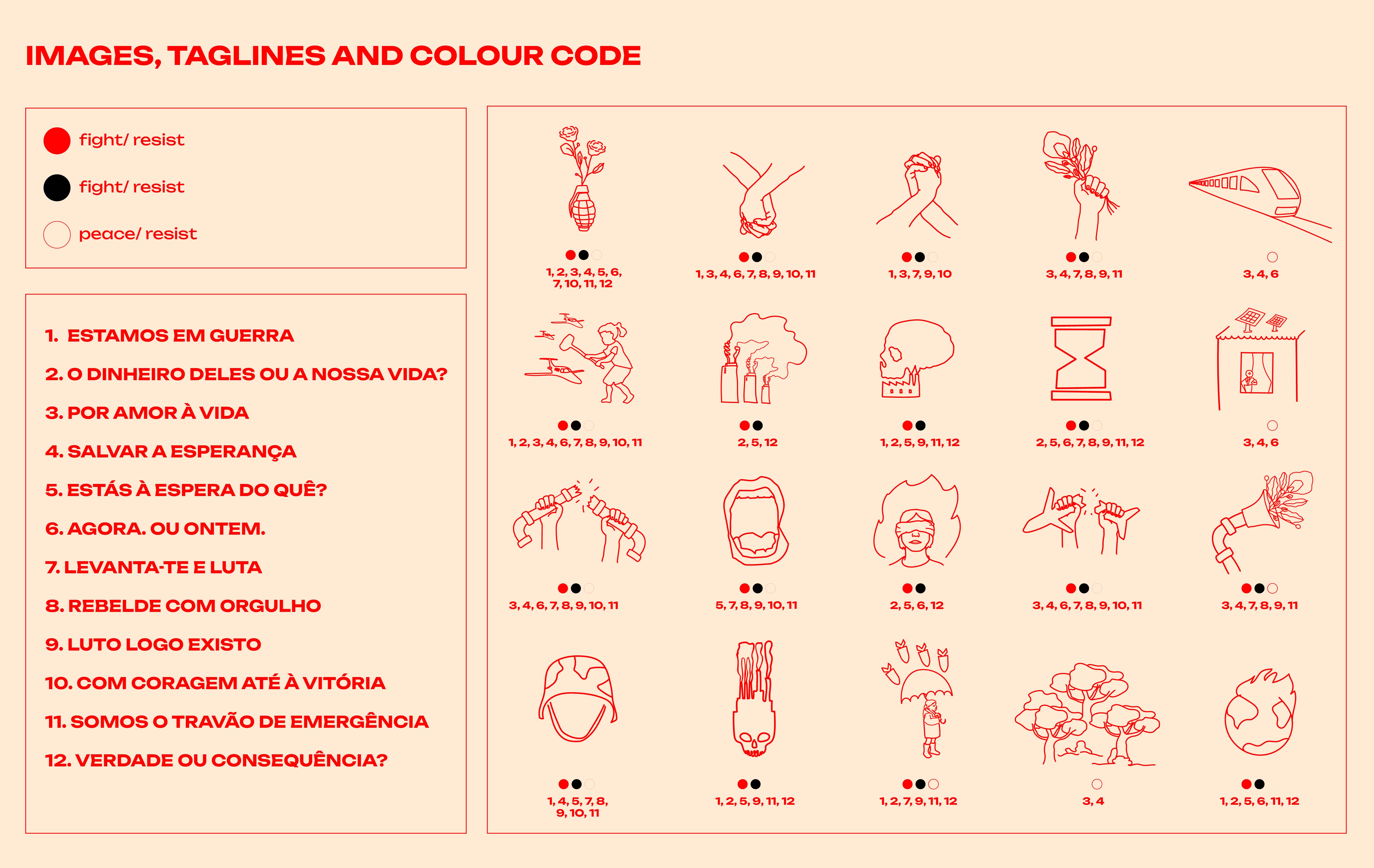
A set of taglines with corresponding illustrations and colour coding was created to help get the message through.
It also helps give the visual consistency when communicating, which the collective was lacking. With a system of specific taglines, illustrations and colours, it is possible to communicate with coherence while translating a complex message into a simple and relatable one.
It also helps give the visual consistency when communicating, which the collective was lacking. With a system of specific taglines, illustrations and colours, it is possible to communicate with coherence while translating a complex message into a simple and relatable one.





Part of Clean Creatives and Creatives for Climate.
Services:
︎︎︎ Strategy
︎︎︎ Branding
︎︎︎ Editorial and Print
︎︎︎ Motion Design